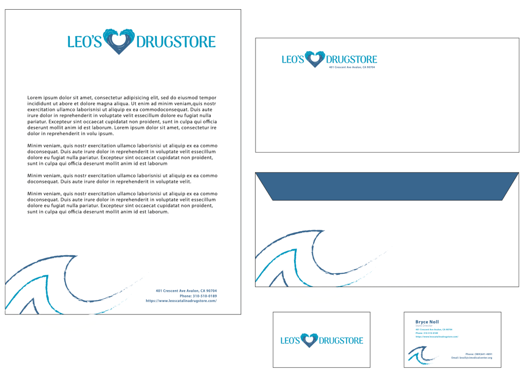
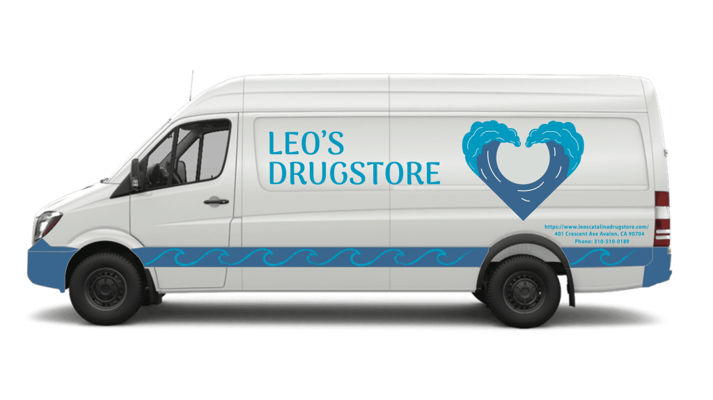
The client wanted a new logo that expressed themselves as a brand something new and refreshing. This store is located on Catalina Island and is both a souvenir shop and a pharmacy. While making this logo I made sure to include three things while designing the logo. One they are on an island hence the waves, two they are a pharmacy which is why the waves form a heart as a medical symbol. Not only is the heart there to provide feels for a pharmacy, but also to show that they treat all their customers with love.

Leave a comment