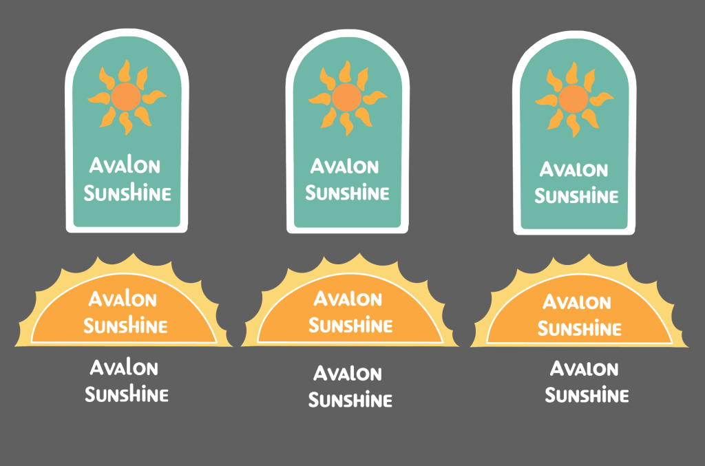
I made these two logos for one of my bosses. She wanted a logo to make into a wooden sign and hang outside her store. I looked at the competing signs down that same street. I wanted something a little bit different so it could stand out which is why I used these colors, they also give off an island vibe which I feel is most important along with the sun symbol for the name of her store. The different variety of logos down below show a difference in type font that I edited, making the letters the same height.

Leave a comment